Testing out first user interfaces

Note: All wording and text here is for test purposes only
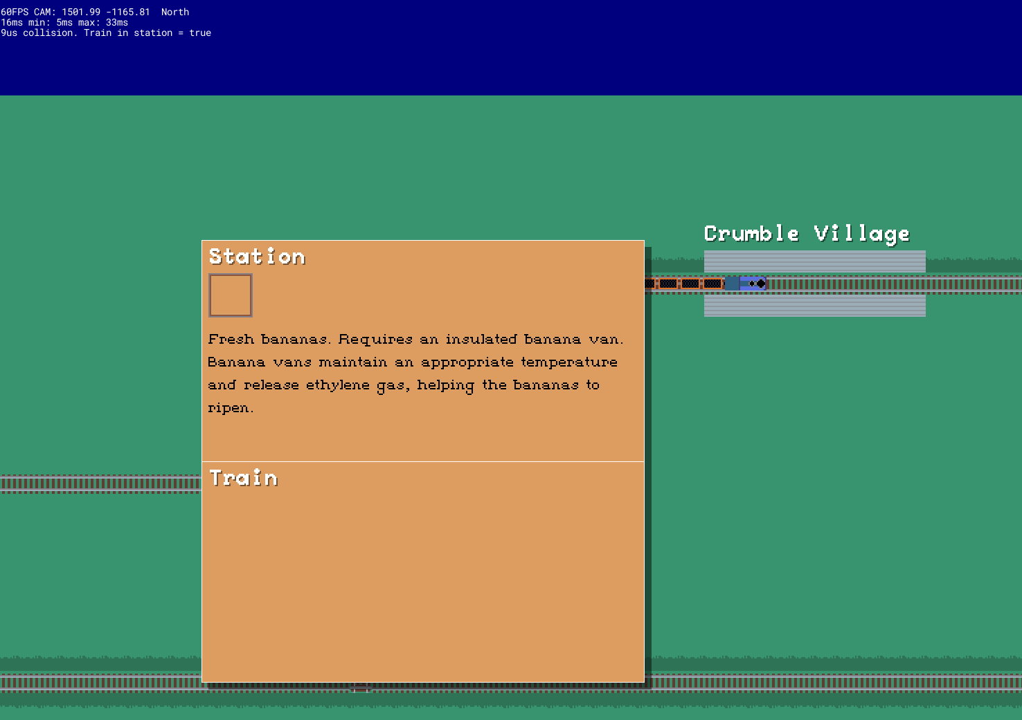
Been doing some UI tests today. The image above shows the station interaction window where you would give and take items. Right now it's just printing empty items and spewing up a random item description into the centre - all just proof-of-concepts of what I need to be able to do for real.
So all of this stuff is still placeholder - but it's nice to get something working. It has also made me realise I need to do a little bit more work behind the scenes before this window can function properly. For example, right now there is no real data model backing what kinds of carriages the train has and what cargo they carry. That obviously needs to change if cargo require specific vans and locomotives.
In addition, I need to start thinking about the economy a bit. I will probably just throw in a 'base value' for items to start with - but clearly that isn't going to be enough. For example, should they fluctuate or be based on distance (e.g. like Transport Tycoon). Or should the availability of certain items for transit be based on % chance?
Definitely one of those tasks that spawns hundreds more subtasks as a result.
Anyhow, fleshing out this dialog and getting it working will probably be for next weekend now. I'll see what errands I fit in between now and then.
Train game
A work-in-progress game probably featuring trains. Not a puzzle game.
| Status | In development |
| Author | d w roberts |
| Tags | Life Simulation, Trains |
More posts
- Train delayed (or cancelled)Nov 04, 2023
- Back on track(s)Jun 01, 2023
- Train yardsApr 23, 2023
- Frame timing hellApr 21, 2023
- Basic object placementApr 15, 2023
- Spline cleanupApr 10, 2023
- NPCs, shops, inventoriesApr 09, 2023
- Basic gameplay milestoneApr 03, 2023
- Invisible technical workApr 02, 2023
- Putting some more thought into artworkMar 26, 2023
Leave a comment
Log in with itch.io to leave a comment.